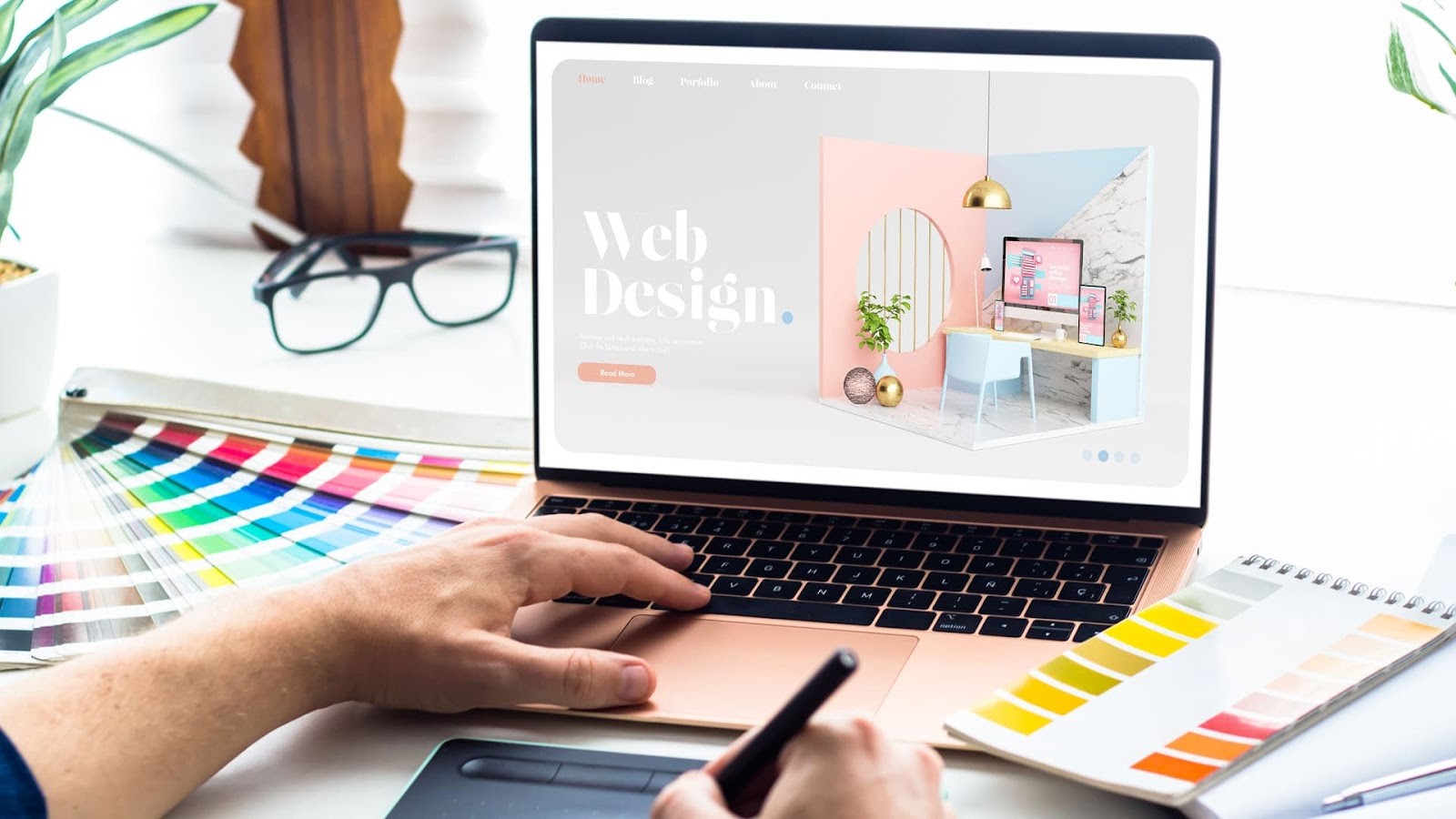
A strong first impression is one of the most crucial elements of a quality website. From the very first moment, users subconsciously judge an array of factors, whether it’s the load time, the design, or how quickly it answers a question. It’s a reality never to lose sight of; users form an opinion about a website within milliseconds.
A poorly designed website can lead to disastrous consequences, including high bounce rates (visitors leaving your site quickly), lost sales, and damage to your brand’s reputation.
To help you avoid these costly mistakes, we turned to the experts at Full Stack Industries, a leading website design company. They’ve shared their insights on the most common website design blunders and how to avoid them.
7 Common Website Design Mistakes
1. Slow Loading Times:
In the modern world, users expect websites to load quickly, and they’re right. A delay of even a few seconds can lead to frustration and cause visitors to abandon your site and not want to return.
As Full Stack Industries says, “Ideally, your website should load in under two seconds. Each second that passes can significantly increase your bounce rate. Slow loading times frustrate users and negatively impact your website metrics.”
2. Poor Mobile Optimisation
A huge 60% of internet traffic now comes from mobile devices, so your website must be optimised for smaller screens. A non-responsive design that doesn’t adapt to different screen sizes can make it difficult for mobile users to navigate and interact with your site, leading to a poor user experience.
Full Stack Industries recommends using a responsive design framework that automatically adjusts your website’s layout and content to fit any screen size. They also emphasise the importance of testing your website on various mobile devices to ensure a seamless experience for all users.
3. Cluttered Layout and Confusing Navigation
A cluttered layout with too much information and visual elements can overwhelm users and make it difficult to find what they want. Similarly, confusing navigation can leave visitors feeling lost and frustrated.
“Clear and intuitive navigation is key to a positive user experience,” says Full Stack Industries. “Users should be able to easily find the information they need and navigate your site without getting lost. Use a simple, logical navigation structure with clear labels and calls to action.”
4. Lack of Clear Calls to Action
Calls to action (CTAs) guide users to take a specific action, such as purchasing, signing up for a newsletter, or contacting your company. If your CTAs are unclear and prominently displayed, visitors may need help knowing what to do next, leading to missed opportunities.
Effective CTAs are clear, concise, and visually appealing. Use action-oriented language and contrasting colours to make your CTAs stand out. However, don’t bombard users with CTAs; find a balance between providing value and converting.
5. Outdated Design and Content
An outdated website can make your business appear unprofessional and out of touch. It’s important to keep your design and content fresh and relevant to maintain a positive brand image and engage visitors.
Regularly updating your website’s design and refreshing your content is a simple way to keep it current. Always consider what you could do to grow your website, and don’t underestimate the power of writing quality on-site content.
6. Accessibility Issues
Web accessibility means designing your website so everyone, including people with disabilities, can use it. Ignoring accessibility can quickly alienate a portion of your audience, which must not happen.
Ensure your website adheres to Web Content Accessibility Guidelines (WCAG) by providing alternative text for images, using sufficient colour contrast, and making it navigable using a keyboard.
7. Ignoring SEO
Search engine optimisation (SEO) ensures that your website appears in search engine results pages (SERPs) when users search for relevant keywords. Neglecting SEO can significantly impact your website’s visibility and organic traffic.
Full Stack Industries stresses incorporating SEO best practices into your website design. This includes using relevant keywords in your content, optimising your images, and ensuring your site loads quickly.
By avoiding these common website design mistakes and following expert advice, you can create a website that looks great, delivers a positive user experience and drives results for your business.
Final Thoughts
Investing in good website design isn’t just about aesthetics; it’s about creating a functional and accessible platform that represents your brand and meets the needs of your audience. As Full Stack Industries wisely advises, “Partnering with a professional web design company ensures your website looks great and performs flawlessly, helping you achieve your business goals.”


 Bitcoin
  Ethereum
  Tether
  XRP
XRP  Solana
  USDC
USDC  Cardano
  TRON
TRON  Lido Staked Ether
  Toncoin
  Avalanche