What is Colour Psychology?
Colour psychology is the study of how colours affect perception and behaviour. It is a technique that has always been used in marketing to persuade customers to see a brand in a specific way.
According to Colorcom, 92.6 percent of people said that visuals are the most important factor when purchasing a product. Only 5.6 percent consider the physical feel the dominant factor.
By knowing this information, it is clear that the way the psychology of colours is used in marketing and branding is fundamental.
Colour Psychology in Branding
The right colours can help with brand identity. Choosing a consistent palette will make it easy to be recognised, stand out and attract the perfect customer.
To choose the right colour, it is crucial to consider your brand personality. Thinking of it as a person may help, Is it creative, fun, sincere or serious? Understanding this will bring you in the right direction.
Take Inspiration from Others
Looking at advertisements and websites of other brands can help you better understand how the psychology of colours is used in marketing.
Colour Psychology Examples
As previously discussed, colours have meanings and affect our moods and emotions. Colours can increase brand recognition by 80%. It is important to note that the meaning of colours can vary based on personal and cultural factors. Below are some examples
Red
This powerful colour usually transmits passion, urgency, and excitement. In marketing, it is traditionally applied to call-to-action buttons or price promotions.
Coca-Cola is the best example, as it uses red consistently across its products and content, making it a key part of its visual identity.
Although this colour is associated with strong emotions, depending on how you use it, it could foster negative feelings, as it represents warnings and anger.
Blue
Blue is an extremely calming colour and is associated with many positive qualities. It is the world’s favourite colour as it transmits a sense of security, trust, and responsibility.
Social media, such as Facebook and Twitter, often use blue to appear dependable, while healthcare or finance companies use it to give a sense of reliability.
Because there are not many naturally blue foods in nature, this may decrease a person’s appetite, hence why food brands avoid using this colour in their marketing.
Green
This colour is used in multiple ways as it makes individuals feel relaxed and healthy and gives a sense of optimism and hope.
Companies like Quadrant2Design, a leading sustainable exhibition stand design company, use green in their branding to show that they are environmentally friendly.
Food brands tend to do the same, hence why when you enter a health food shop you can notice how this colour is strategically used on every section. Many trademarks also use green for their “add to cart” buttons as it motivates customers to take action.
Yellow
Yellow is commonly used as a colour to represent joy, optimism and happiness.
Using yellow in marketing can stimulate people to communicate more and it promotes sharing.
Brands that use yellow in their branding, usually pair it with another colour as it is hard to read such a light type. Hence why they must apply the psychology of colours carefully.
McDonald’s is the most iconic company to use yellow – the colour is used everywhere in their stores, products, social media and advertisements.
The brand uses colour psychology in its branding to attract customers. Paired with red, it is a psychologically effective combination. Red triggers hunger and energy, while yellow happiness.
Pink
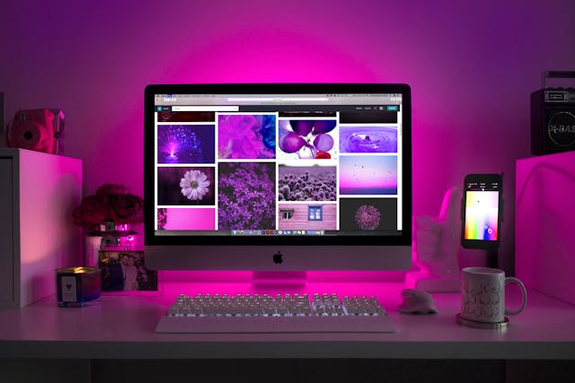
This is the colour that represents femininity and youthfulness the most. Usually used for products and services targeted at women. It is also associated with love and kindness and it boosts creativity.
The shade of pink can make a difference; brighter pinks are usually targeted at a younger segment and could appear cheap, while a softer, dusty shade is usually used with an older market.
Barbie strategically uses pink in its campaigns to bring nostalgia and happiness, the font used on the logo resembles a child’s handwriting to create a sense of childhood.
Conclusion
To conclude, the psychology of colours is a crucial tool for brands to connect on a deeper level with their target audience. Making sure they align with your brand’s personality and beliefs is fundamental.
There is no right or wrong guideline to choose the colour for your brand. However, it is important to take time to consider the psychology of colour perfect you choose.


 Bitcoin
  Ethereum
  Tether
  XRP
XRP  Solana
  USDC
USDC  Cardano
  TRON
TRON  Lido Staked Ether
  Avalanche
  Toncoin