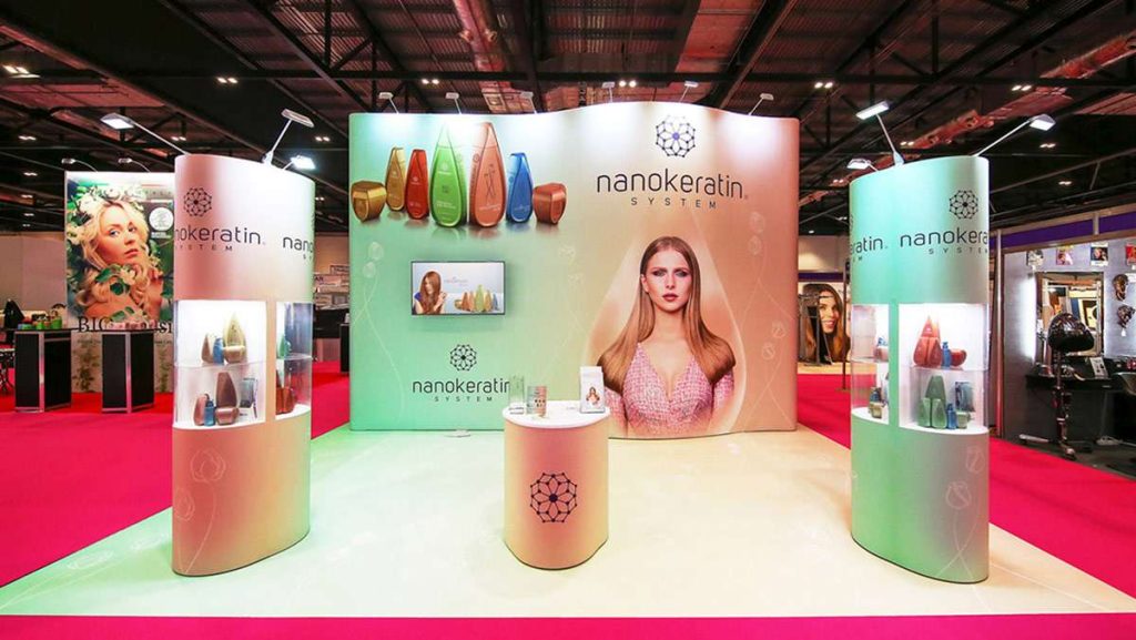
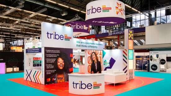
Among the factors determining the success of an exhibition stand, graphic design is arguably the most important. At its core, the exhibition is a visual competition, a rendering of the market into 3×3 meter units, one stacked against the other. If you can draw more eyes toward your stand with a standout exhibition branding, you have immediately gained a leg up over your competitors. Here are some tricks to gaining this advantage.
Learning the rules so you can break them
Each industry has an aesthetic that surrounds it. Fashion and wellness are characterised by soothing colours, smooth lines and elegant colour schemes. The IT sector will be more understated, preferring sleek, unobtrusive visual imagery. Take a nod from famous brush-wielder Pablo Picasso, who declared an artistic dictum, ‘Learn the rules like a pro, so you can break them like an artist.’ Learning the rules, the visual landscape of the exhibition, will enable you to make calculated decisions in order to set yourself apart. If you know everyone’s turning up with bright colours and floral graphics, you can cut through the noise with a sharp, dark-coloured stand and an industrial aesthetic. Humans categorise visual data from most important to least, starting with what stands out above the rest. The initial ‘draw’ is not beauty and good aesthetics as such, but rather what features dissent from the norm. Correctly tapping into this will mean that eyes land on your stand before they’ve even acknowledged your competitors.
Move towards the light
When you’re walking through an upmarket department store or airport duty free, you’ll have noticed the feeling of bombardment that one experiences in this commercial paradise. Brands on all sides vying for your attention, modern lighting and panelled floors. Much of the sensory effect that these places achieve is down to lighting. Most of us are familiar with fairy lights and the numerous domestic lighting appliances that have flooded the market in recent years, but for businesses seeking to exhibit seriously, there are dozens of dazzling light applications you can consider. Have a look at high-quality past exhibits and the inventive ways in which lighting was employed for inspiration, but really the sky is the limit. Thinking outside the box for unique design ideas is a surefire way to put yourself ahead of the competition in the attention-grabbing race of the exhibition.
Size matters
We’re crude beings, after all. The biggest, tallest, loudest stand is all-too often the most eye-catching. Of course, some exhibition halls have a height limit, but those that don’t offer exhibitors the opportunity to replay the Tower of Babel story and build to the stars. Bigger stand = more visibility = more consumer interest. With that said, a dull graphic on a big stand is still a dull graphic, now blown up to full size where everyone in the hall can see your artistic ineptitude.

Graphics: an anti-stock stance
With that in mind, your choice of images is one of the most important design choices you will be making. Stock photos, anything with happy, smiling customers in nondescript locations are the bane of visual marketing. Imagine you’re a customer walking through the exhibition floor. You notice a large stand sticking out from the rest; you take a moment to inspect it. An impression should immediately be made that this is an original image, something exciting, something pertaining the company perhaps — all in all, something that warrants a second look. It doesn’t have to be the Mona Lisa; it just has to plan out to offer something of interest to the viewer. This will most likely be something original and unique to your business, but it could just be a great, high-quality imagery you had taken professionally. Whatever the case, avoid stock imagery like the plague.
Words
For many graphic designers, writing copy is cause for sighs and eye-rolls. It’s one thing to be visually creative, but to generate engaging written copy on top of that? Quite a daunting task. Unless you have an in-house copywriter or marketing team (or the contractor you’re using does), your best bet is to get some ideas down yourself. There aren’t really any hard-and-fast rules to exhibition copy, but the central tenet is to use words extremely sparingly, only including text that’s original and non-filler. Clichéd language like ‘making a difference’, ‘innovation in tech’, ‘bringing the future to you’ is all a big no. Why tell visitors you’re just like every other company that’s ever exhibited? An exhibition is a rare opportunity to impress customers, or at least tell/show them something they’ll remember. There are millions of words in the English language, many of which have never been used in exhibition contexts before. Novelty is king. Yes, it may be difficult, and yes, you’ll throw away more ideas than you’ll keep, but if you come up with just one, 3-word tagline that sticks in one’s mind and warrants a second thought, then you’ve just earned a huge bonus as an exhibitor.
Fancy features
As mentioned above, big and flashy works. Rotating headers, interactive screens and LED walls are all technological applications that people will enjoy seeing and engaging with. Don’t limit yourself to these gadgets, but equally don’t underestimate their utility.
For those that are used to handling the business side, tending to shy away from the task of creative design, the prospect of exhibiting can seem intimidating. But, as the one who knows your business best, you’re also best-suited to the challenge. Alan Jenkins of exhibition contractor Quadrant2Design comments, ‘Every business should have a hand in its exhibition planning. Even if it’s only a short brainstorming session, business owners will have insight into their brand, stories to tell that can be translated into design by a great team.’ Get in touch with a solid, reliable contractor, and start preparing for your visual exposé to the world.


 Bitcoin
  Ethereum
  Tether
  XRP
XRP  Solana
  USDC
USDC  TRON
TRON  Cardano
  Lido Staked Ether
  Avalanche
  Toncoin